Every interface is a decision environment
A product rarely tells users exactly what to do.
Instead, it presents options.
A button.
A menu.
A recommendation.
A default setting.
A list of plans.
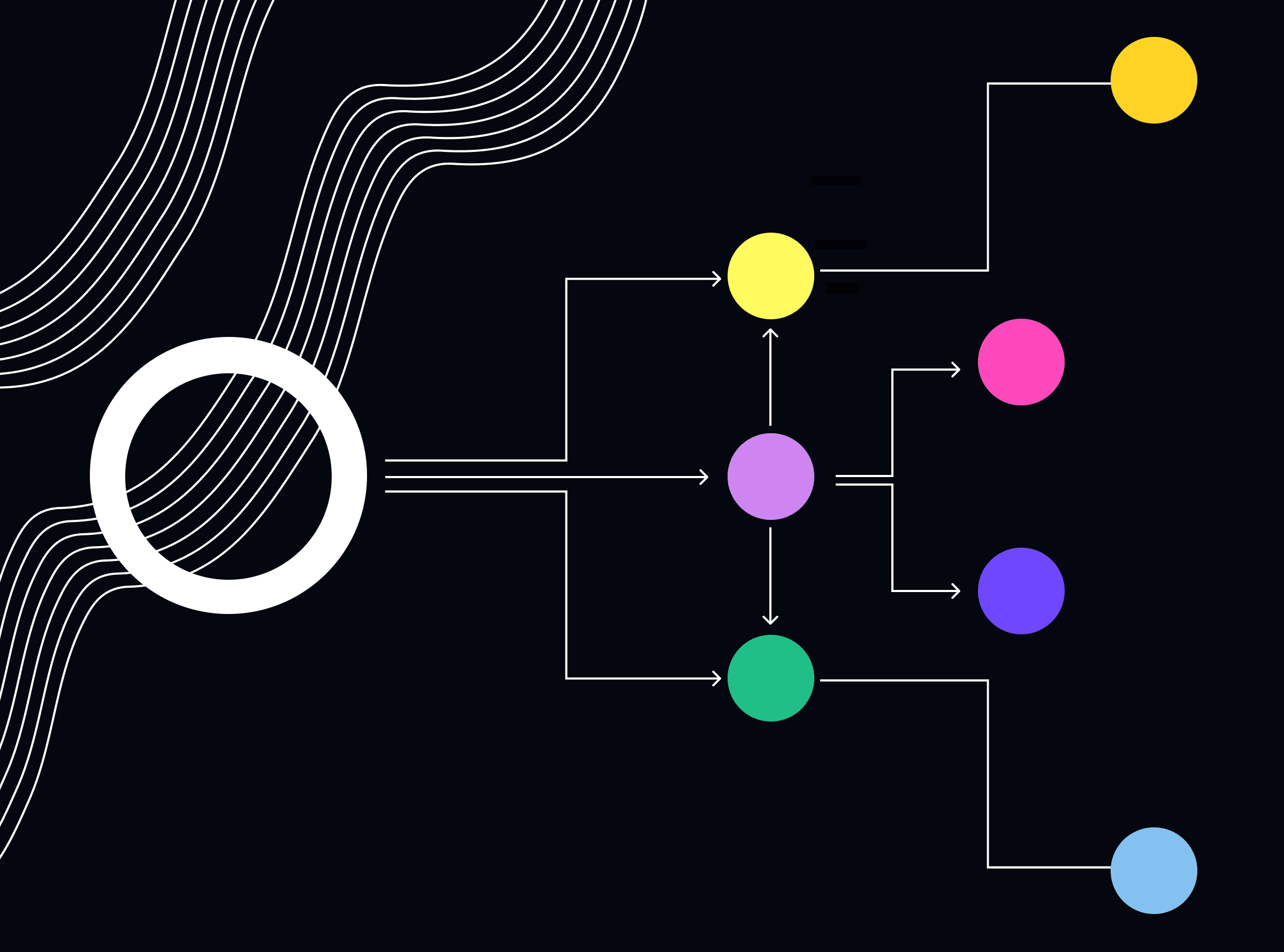
These choices create an environment in which behavior happens.
Two products can offer exactly the same options and produce very different outcomes simply because those options are structured differently.
This is the foundation of choice architecture.
More choice does not always mean more freedom
Product teams often assume that giving users more options creates a better experience.
It can do the opposite.
When users face too many alternatives, decision-making becomes harder.
This connects to Hick's Law, which suggests that the time required to make a decision increases as the number of available choices increases.
Think about:
3 subscription plans vs. 12
5 filters vs. 30
one recommended action vs. six competing CTAs
More options can create more cognitive load.
Good behavioral design doesn't remove choice unnecessarily.
It makes important choices easier to understand.
Defaults quietly influence decisions
One of the strongest behavioral patterns in product design is the default.
Users frequently accept the option that has already been selected.
Defaults reduce effort.
They also communicate what the product considers normal or recommended.
Examples include:
default notification settings
recommended subscription plans
preselected delivery options
suggested search filters
automatically saved preferences
This creates responsibility.
A default is not neutral.
If the easiest option benefits the business but harms the user, the design becomes manipulative rather than helpful.
The path of least resistance
People naturally tend to conserve effort.
This is why friction has such a strong influence on behavior.
Consider two actions:
Action A
Three taps, clear label, immediate feedback.
Action B
Seven steps, unclear terminology, confirmation screen, unexpected error.
Even when users prefer the outcome of Action B, many will choose Action A.
This is where BJ Fogg's Behavior Model becomes useful.
Behavior becomes more likely when motivation, ability, and a prompt come together.
Sometimes the most effective behavioral intervention is simply making the desired action easier.
Attention is a limited resource
Users don't process every element on a screen equally.
They scan.
They prioritize.
They ignore.
Visual hierarchy therefore becomes behavioral architecture.
Placement, contrast, spacing, grouping, and timing can all influence what users notice first.
This is closely connected to principles such as:
Von Restorff Effect: distinctive elements are more likely to be remembered.
Serial Position Effect: people tend to remember items near the beginning and end of a sequence.
Zeigarnik Effect: incomplete tasks can remain more mentally salient than completed ones.
These aren't decoration rules.
They help explain why certain interface structures influence attention and action.
The order of choices matters
Imagine an onboarding flow asking users to:
choose their goal
select preferences
create an account
personalize recommendations
Now reverse it.
The experience changes even though the questions remain identical.
Sequence affects momentum.
Early actions can establish context for later decisions.
This is why behavioral design should consider the journey, not just individual screens.
Reduce decisions at the right moment
Good products don't eliminate decisions.
They eliminate unnecessary decisions.
Instead of asking users to configure everything immediately, progressive disclosure can reveal complexity when it becomes relevant.
Instead of presenting every possible action, the interface can emphasize the next meaningful one.
Instead of forcing users to remember information, the product can surface it at the moment of need.
The goal is not to make users think less.
It is to make them think about the right things.
Ethical choice architecture
Behavioral design becomes problematic when influence is hidden or exploitative.
A useful distinction is:
Guidance helps users make better decisions.
Manipulation helps the product get what it wants at the user's expense.
Dark patterns often exploit the same behavioral principles used in good design:
defaults
urgency
scarcity
social proof
friction
The difference is intent and transparency.
Designing behavior comes with responsibility because every optimized interaction affects a real person.
Design for the decision, not the screen
The best behavioral designers don't ask:
"Where should this button go?"
They ask:
"What decision is the user trying to make?"
Then they consider:
what information the user needs
what alternatives exist
what friction is unnecessary
what the consequences are
what behavior the interface encourages
This moves behavioral design from interface optimization to decision design.
Takeaway
Users don't experience your product as a collection of screens.
They experience it as a sequence of decisions.
The options you present, the defaults you choose, the friction you introduce, and the attention you direct all shape what users eventually do.
Good behavioral design doesn't control users.
It creates conditions that make useful behavior easier, clearer, and more intentional.
Because every product has a choice architecture.
The only question is whether you've designed it deliberately.