Designing a High-Signal LinkedIn Profile
Client
LinkedIn Profile Cover
Year
2026
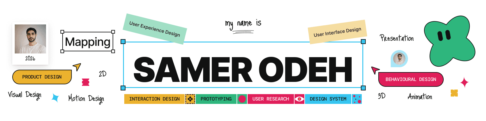
Overview
The LinkedIn profile cover was designed as a visual extension of a product designer's personal brand, turning a limited profile surface into a concise introduction to expertise, disciplines, and design approach.
The concept combines bold typography, playful visual elements, structured labels, and editorial composition to communicate a broad product-design skill set while keeping the overall experience approachable and easy to scan.
Context
Platform
LinkedIn professional profile.
Audience
Recruiters, design leaders, product teams, founders, and professionals discovering the designer's work.
Communication Goal
Communicate who the designer is, what they specialize in, and the range of disciplines they work across within a single visual composition.
Design Challenge
Communicating multiple design disciplines within a limited space
Establishing a clear personal identity at first glance
Balancing information density with visual simplicity
Showing breadth without making the banner feel like a résumé
Creating a visual identity that feels professional while retaining personality
Design Strategy
1 – Personal Positioning
Making the designer's name the primary visual anchor
Establishing Product Design and Behavioral Design as key areas of focus
Supporting the positioning with related design disciplines
Creating a hierarchy that can be understood through quick scanning
2 – Expertise Mapping
Organizing UX, UI, interaction, research, prototyping, and design systems into a connected visual language
Including complementary disciplines such as visual, motion, 2D, 3D, animation, and presentation design
Using labels and visual markers to communicate breadth without lengthy descriptions
3 – Visual Personality
Combining structured typography with hand-drawn elements and playful graphics
Using contrasting colors to separate different areas of expertise
Introducing informal visual details to make the professional profile feel more human
Balancing personality with a clear information hierarchy
4 – Information Design
Treating the banner as a communication system rather than a decorative image
Grouping related disciplines into clear visual clusters
Establishing a reading hierarchy around identity, core expertise, and supporting skills
Designing the composition to remain understandable at a glance
Visual System
The visual language combines bold typography, colorful labels, hand-drawn annotations, geometric markers, and editorial composition.
The contrast between structured information and playful visual elements creates a personal brand that feels both strategic and approachable, reflecting the multidisciplinary nature of the designer's work.
Information Architecture
The banner follows a simple hierarchy:
Identity → Core Expertise → Supporting Disciplines → Design Capabilities
This allows the viewer to quickly understand the designer's positioning before exploring the rest of the profile.
Outcome
Created a distinctive visual identity for the LinkedIn profile
Communicated a broad multidisciplinary design skill set within a constrained format
Established clear hierarchy between core and supporting areas of expertise
Turned the profile cover into an intentional personal-brand touchpoint
Created a visual system that balances professional positioning with personality
Scope of Work